UX designer

ZURU
GIS
I’m working for a company that develops a Geographic Information Software (GIS), a tool that is used to analyze enviromental data in a variey of contexts (i.e. prevent enviromental hazard, map an area, produce air quality reports, etc.)
In the aftermath of an earthquake, the Civil Protection need to analyze the Emilia Romagna area to find the best routes for Emergency Services to arrive in the affected areas.
The user needs to:
-
navigate large sets of data;
-
make sense of data and informations;
-
filter data and informations;
-
support non linear user flows;
This is what the client expected from my delivery:
-
comparative research of similar softwares;
-
produce a persona;
-
produce a user flows;
-
medium quality mockup;
-
a clickable protoype;


RESEARCH
COMPARATIVE ANALYSIS
This step was essential to gain a comprehensive understanding of the competitive landscape, identify areas for differentiation, and make informed decisions during the software design process. Clear objectives were defined to ensure that the research would be focused and valuable.
This involved several key activities:
Online Searches: I conducted extensive online searches using search engines, industry-specific forums, and social media platforms to identify potential competitors.
Client Input: I also engaged with our client to obtain their insights and knowledge about competitors within their industry.
Industry Publications: I referred to industry publications, reports, and news sources to further validate and enhance the list of competitors.
With the list of competitors in hand, the next step was to gather comprehensive information about each one. Once I had collected the necessary information, the final step involved analyzing the data and creating a comprehensive report for the client. This report highlighted key findings, identified trends, and recommended actionable insights based on the comparative analysis. The goal was to equip the client with the information they needed to make informed decisions during the software design phase.

USER PERSONA
My journey began with a deep dive into the world of civil protection. I immersed myself in research, devouring papers and articles to understand the field's intricacies. However, the heart of my journey lay in conversations with real civil protection experts.
These interviews were profound. Listening to their stories and challenges, I felt an immense responsibility to design something truly valuable. Using the insights gained, I crafted user personas that went beyond data; they became characters with names, faces, and stories.
To make these personas relatable to the team, I found images that matched them. These personas guided our design journey, ensuring that every decision reflected the needs and goals of the people who dedicate their lives to safeguarding our communities. It was a personal journey of empathy and commitment, one that brought me closer to the world of civil protection and its heroes.
IDEATION
When it came to designing the GIS web app for civil protection, I was driven by a singular vision – simplicity and effectiveness. I recognized that in high-stress situations, every second counts, and the interface had to be intuitive, clutter-free, and incredibly responsive. This led me to opt for a lean and clean design setup, with a primary focus on the use of an interactive map that seamlessly adapts to the user's needs.
Simplicity as the Core Principle:
The decision to adopt a lean and clean approach was driven by a commitment to simplicity. I firmly believed that the user interface should not add unnecessary complexity to an already demanding field like civil protection. A clean design would reduce cognitive load, making it easier for professionals to access vital information swiftly.
The Power of Interactive Maps:
At the heart of this design strategy lay the interactive map – a full-screen canvas that could be zoomed in and out, as well as moved with ease. This choice wasn't just about aesthetics; it was a strategic decision to provide civil protection experts with an intuitive tool for data visualization and decision-making. With the ability to zoom in to pinpoint specific details or zoom out for a broader view, users would have the flexibility to adapt to evolving situations seamlessly.

Disaster Bar Feature:
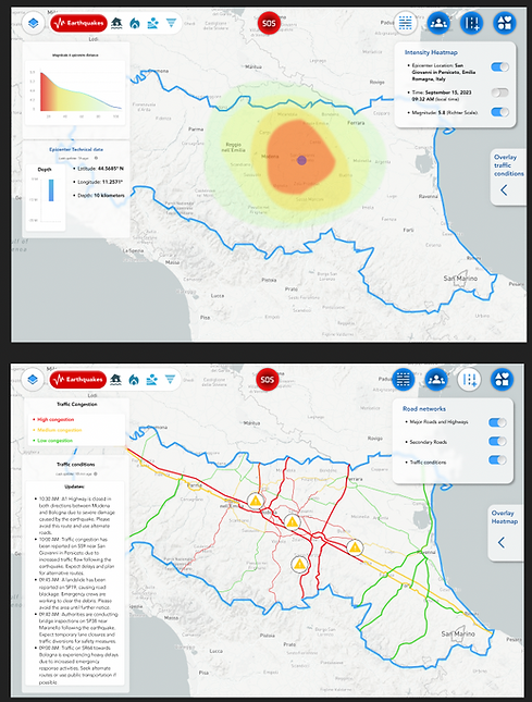
In the pursuit of creating a highly intuitive and user-friendly GIS web app for civil protection, one of the pivotal design decisions was the inclusion of what we affectionately termed the "Disaster Bar." This innovative feature aimed to streamline the user experience and enhance data analysis by offering a dynamic and interactive approach to selecting and analyzing disaster-related data. The Disaster Bar served as a central hub for users to choose the specific type of disaster they wished to focus on. Located prominently within the interface, this feature allowed civil protection professionals to select from a range of disaster categories, such as wildfires, floods, earthquakes, and more. With a simple click, users could narrow down the data to their area of interest.
Disaster-Centric Data Selection:
Once a disaster type was selected, we introduced an additional feature in the upper right corner – the Data Selection Bar. This secondary bar provided users with a refined toolset to choose precisely which data layers and parameters they wanted to analyze within the selected disaster category.
Seamless Data Customization: This two-tiered approach to data selection gave users unparalleled control and flexibility. They could handpick the specific datasets, such as real-time weather data, topographical maps, or infrastructure information, that were most relevant to their current mission or operation. This level of customization meant that users could tailor the GIS web app to their precise needs, ensuring that they received the critical information required for decision-making.


DataLayers:
Upon selecting a specific data category from the Disaster Bar and Data Selection Bar, users were presented with a comprehensive list of data layers related to that chosen disaster type. These data layers encompassed a wide range of information, from geographic features to real-time data streams.
Toggles for On-Demand Information:
To simplify the process of data customization, we incorporated a series of user-friendly toggles. These toggles, intuitively placed within the interface, allowed users to turn data layers on or off with a simple click. This feature ensured that only the relevant and essential information was displayed on the map, reducing clutter and optimizing data visibility.
Seamless Layer Comparison:
Located conveniently at the bottom right of each data layer, the "Overlay Layer" button provides users with the ability to select and visualize a particular layer in a separate data window. This approach allows users to maintain their primary data view while simultaneously opening a secondary window to explore additional information.
The "Overlay Layer" feature is particularly valuable during critical decision-making processes. For instance, when responding to a disaster, users can overlay real-time weather data with topographical maps or infrastructure information. This allows them to assess the immediate impact of weather conditions on the terrain or critical infrastructure, enabling more informed and timely decisions. This feature enhances efficiency and helps civil protection professionals quickly identify correlations and patterns within the data.
A Lifeline at Your Fingertips:
The "SOS Button" is prominently placed within the user interface, ensuring that it's easily accessible even in high-stress situations. With a simple click, users can activate this feature and establish a direct connection to emergency services, eliminating the need to navigate through external phone apps or search for contact information.
Seamless Emergency Calls: Upon clicking the "SOS Button," users are swiftly connected to emergency services, such as 911 or a designated civil protection emergency line. The integration of this feature within the GIS web app streamlines the emergency call process, minimizing potential delays and ensuring that users can report incidents and seek assistance with the utmost speed.

USER FLOW
When it came to designing the user flow for our GIS web app for civil protection, we recognized that agility and adaptability were paramount. Civil protection professionals often face rapidly changing situations that demand quick decision-making. To accommodate these needs, we embraced a non-linear user flow that allowed users to navigate the app in a flexible and dynamic manner.
Understanding the Need for Non-Linearity:
My decision to adopt a non-linear user flow was driven by the understanding that real-world emergencies rarely follow a linear path. Civil protection experts need the freedom to switch between different information sources, data layers, and functionalities rapidly. The non-linear approach allows them to do just that. Instead of enforcing a strict sequence of steps, we designed the user flow to offer dynamic decision points. Users can choose their path based on the evolving requirements of their mission. For instance, they can start by selecting a disaster type from the Disaster Bar, then use the Overlay Layer feature for comparative analysis, and switch to the SOS Button for emergency assistance—all in a non-linear fashion.
Testing and Iteration:
The non-linear user flow underwent rigorous testing and iteration. We collaborated closely with civil protection experts to gather feedback and refine the interface continuously. This iterative approach allowed us to fine-tune the user flow to match the dynamic needs of our users accurately.
Scalable and Future-Ready:
One of the key benefits of a non-linear user flow is its scalability and adaptability to future needs. As the field of civil protection evolves, the app can easily accommodate new functionalities, data sources, and features without disrupting the user experience.
